 Channel Dynamics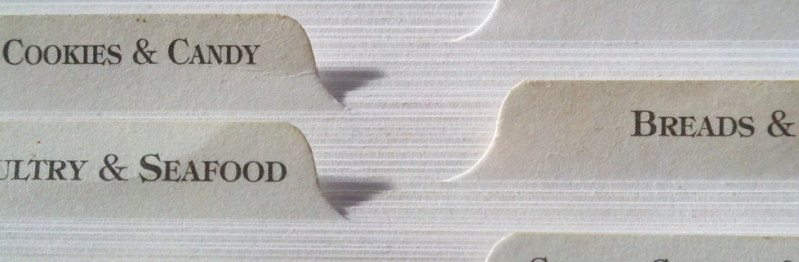
Imagine entering a website like you would a shop in real life. To navigate around the store you would need information to help direct you where to go. In supermarkets they have large signs above aisles to show you where products are located. This idea can be applied to website design to improve your sites’ user experience as tabbed navigation at the top of the page can be used to let your users know where content lies. These are known as in-page tabs and are the type which are built into the website’s design, generally in the header.
Tabbed navigation is popular as users of websites are more often than not coming from Google to a particular page on your site and tabs allow them to see what content your website offers without having to go to a homepage.
When designing a web page with tabs it is necessary to go through a quick checklist in your head.
- Does my user need to view certain content on a page simultaneously?
- Are my tab names nonsensical and too long?
- Are the amount of tabs I need unwieldy?
If you answered yes to any of those questions then tab design may not be right for your website. However for the rest, here are some tips on best practice for tabbed navigation.
Golden Rules
- Tab names must be logically labelled. Users must know what content to expect when they click on a tab. They must also be short – usually 1 or 2 words – as these short labels are more scannable for the reader. One way to test if your tab names make sense is to review your site’s information architecture with users so that they can tell you what they predict will be in any given tab.
- Tabs must only be used when users don’t have to see both tabs simultaneously. If someone is comparing two products on your site or if for an event the time, date and price for admission are all on separate tabs this will increase their frustration with the site and will put unnecessary load on their short-term memory, thereby lowering usability of the site.
- The open tab must be highlighted so users know which tab they are in. A simple enough rule, but it is often thrown out in favour of sleeker UI design. The same issue can arise if the highlighted tab is not noticeable enough.
- Use the same design for your tab as the open content area. This includes colours, typography and in parallel with other tabs to help tell the user, which tab is currently open.
- Tabs must be placed on top of a website – not on the sides or down at the bottom as users will often overlook those areas.
Summary
As tab use becomes more popular users will start to develop a schema on how to interact with a website that has tabs, so it is important to design with the fundamentals in place.
User research and information architecture will assist you when thinking about how best to lay out your website. You need to find out how users want to view your content and what route you should create to assist users in accessing that content.
Channel Dynamics can help by performing user research, testing prototypes, and suggesting the best structure for your site. Or take one of our training courses to set you and your team up for successful testing in-house.